
Notification and feedback
Notification goals
Keep users informed at the right time and place without overwhelming them.
Only send notifications where necessary. Confine each notification to the portion of the interface and workflow it is relevant to.
Notification type
Task-generated (user-triggered)
Initiated in response to a user's action. Give direct, immediate feedback. Place them in the region of the page the user is working in.
Examples:
- A form submits successfully
- There is a problem uploading a file
- Searched item can't be found
System-generated (app-triggered)
Initiated by the application or system, independent of user action. Since they're unrelated to the user's current task, provide enough context to understand what happened.
Examples:
- Network connection lost
- Planned maintenance coming soon
- Trial period is about to expire
Notification status
| Status | Color | When to use |
|---|---|---|
| Neutral | Gray | General information that doesn't require emphasis or urgency |
| Info | Blue | Helpful context or tips that assist the user |
| Success | Green | Confirms a completed action |
| Warning | Yellow | Alerts users to potential issues. Use when the user can still prevent a problem |
| Error or danger | Red | Signals that an outcome has already failed, or warns before an irreversible action |
| Ad-hoc | Purple | Non-standard messaging |
Component inventory
- Alert: auto-dismissing confirmation of a completed user action
- Banner: system-level, page-level, or section-level messages; persistent
- Illustration or empty state: full-page errors (404, 503/504) and empty data states
- Modal: critical or complex actions requiring full focus
- Notification panel: persistent log of system-generated events
- Popover: rich contextual info; inline confirmation (e.g. delete)
- Inline indicators: compact, in-context state shown alongside the affected element:
- Badge: labels, status tags, categorization
- Progress bar: known-duration operations (10+ seconds)
- Spinner: unknown-duration operations (1–10 seconds)
- Status indicator: compact dot indicator for item-level state changes
Decision diagrams
Error path
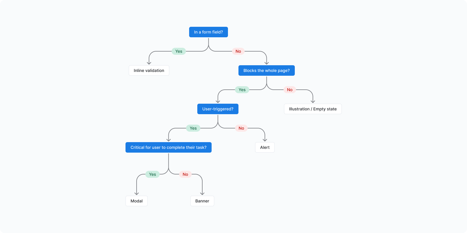
Non-error path
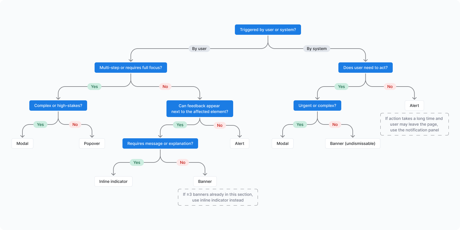
Component usage guidelines
Alert
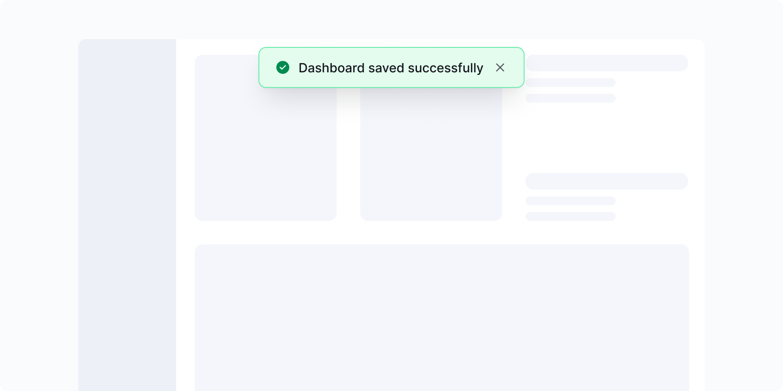
An alert is a brief message that provides timely feedback, including confirmations, warnings, and errors.
When to use
- Display temporary short messages (e.g. "Your changes will be saved and reflected in Reporting")
- State actions performed by users (e.g. "Dashboard saved successfully")
- Provide immediate feedback after form submissions (e.g. "Failed to save changes. Try again.")
Consider alternatives
Alerts are low-priority messages. Use higher-priority components when stronger attention or action is required.
- For important messages that need to remain in the interface, use Banner instead
- For complex messages that require immediate action, use Modal
- For messages that require explicit user confirmation, use Modal or Confirmation popover
Badge
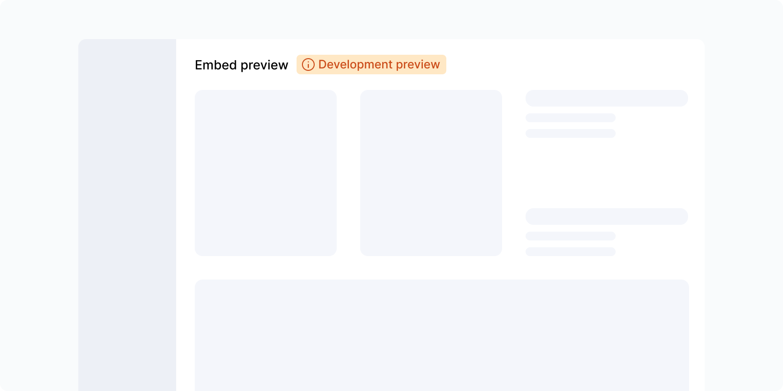
A small label used to categorize, tag, or highlight status information on an element.
When to use
- Displaying the status of an item (e.g. "Published", "Draft", "Failed")
- Categorizing or tagging content for quick scanning
- Highlighting metadata or attributes on cards, rows, or list items
Consider alternatives
- For dynamic, time-sensitive feedback on an action → Alert or Banner
- For item-level state with limited space → Status indicator
Banner
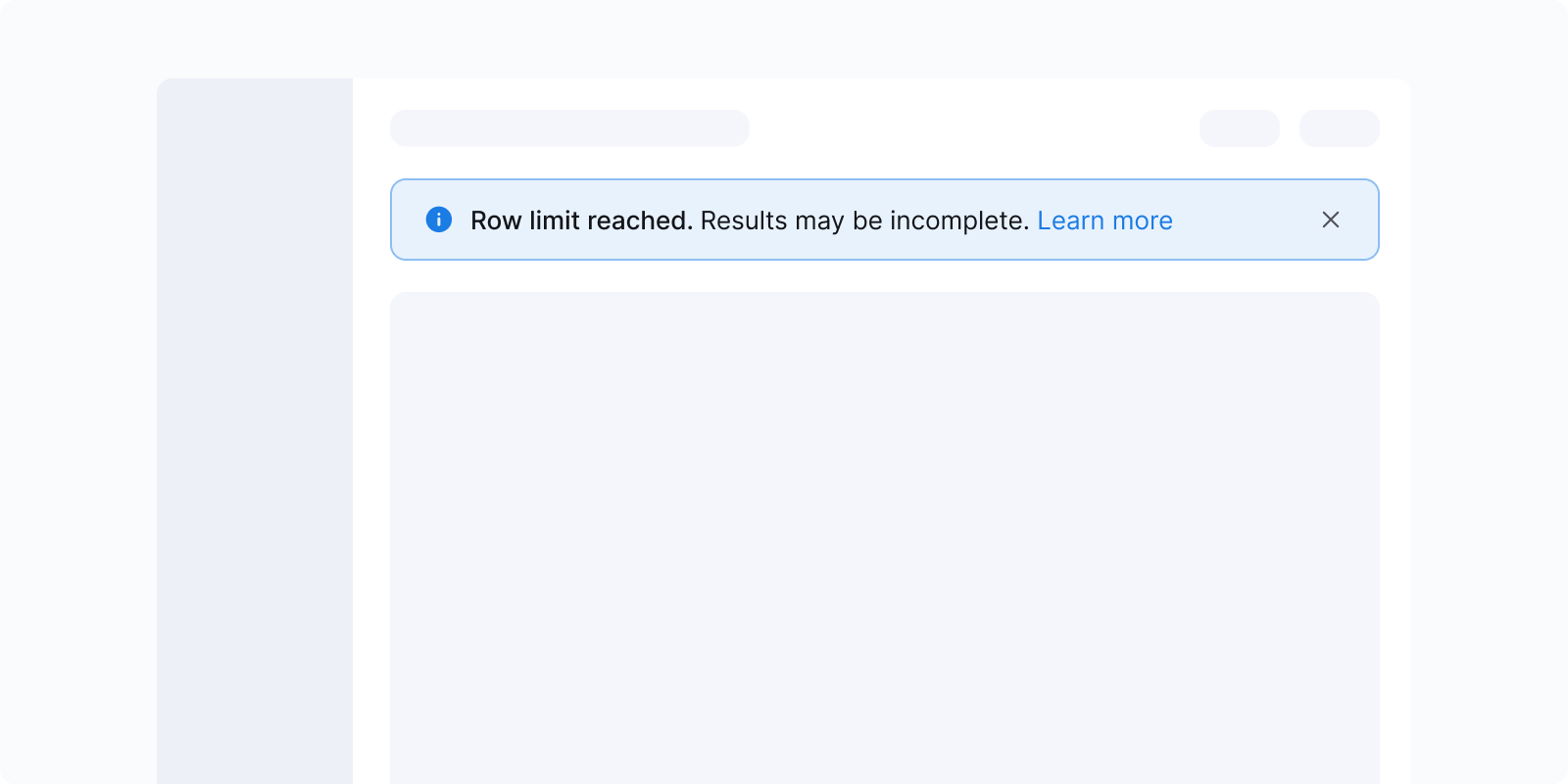
A banner communicates important, persistent information at the page or system level. It draws attention without blocking the workflow.
When to use
- Highlight important information that should remain visible until it's read or resolved
- Communicate page-level or system-wide status, updates, changes, or tips
- Draw attention to issues that may require follow-up, even after the current action
Consider alternatives
Banners are medium-priority messages. Use higher- or lower-priority components based on criticality and whether action is required.
- For temporary messages, use Alert instead
- For complex messages that require immediate action, use Modal
- For messages that require explicit user confirmation, use Modal or Confirmation popover
- If ≥3 banners are already shown in the same section, consider using an Inline indicator instead
Illustration or empty state
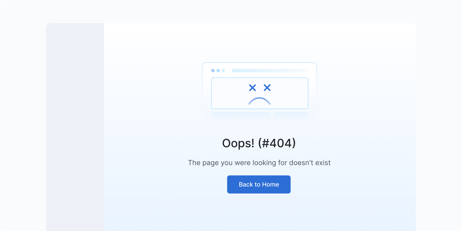
A full-page or full-section message combining an illustration with an explanation and an optional call to action (CTA). Used when there is no content to show or when a page-level error has occurred.
When to use
- Error pages: 404 (page not found), 503/504 (server error, timeout). Show an illustration with a clear explanation and a way to recover (e.g. "Go back", "Retry").
- Empty data states: first-time use of a feature with no data yet, or a filtered view that returns nothing
- Permission/access errors: user lacks access to a page or resource
Consider alternatives
Content structure:
- Illustration (communicates the situation visually)
- Title (what happened, e.g. "Page not found" / "No reports yet")
- Description (brief explanation, 1–2 sentences)
- CTA (optional: "Go home", "Retry", "Create your first report")
Modal
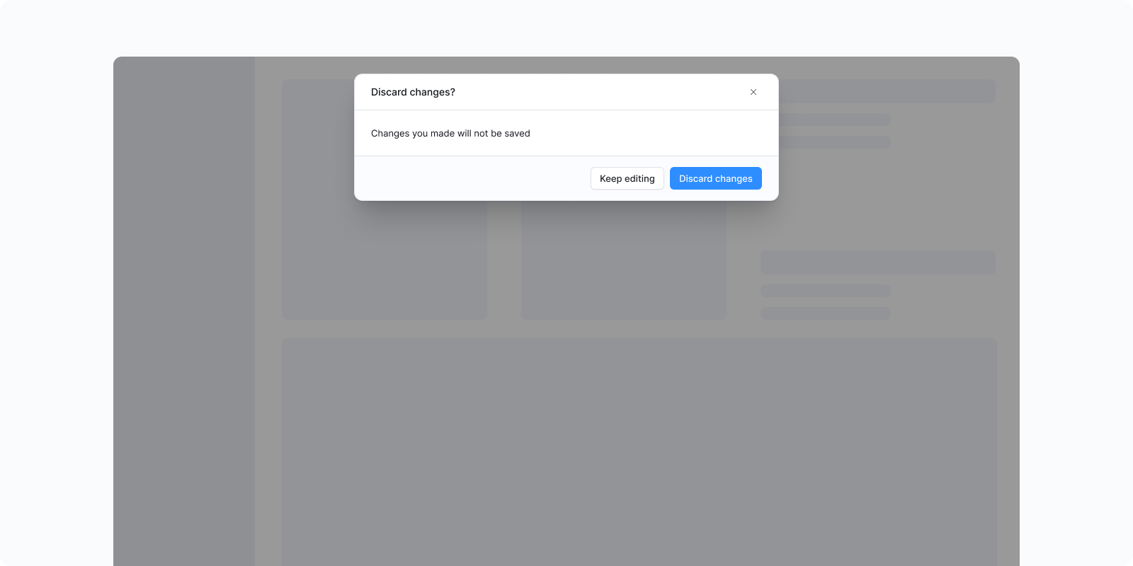
A window overlaid on the primary content, blocking interaction until acknowledged.
When to use
- Confirming high-stakes destructive actions (delete all, disconnect integration, irreversible change)
- Collecting form data in isolation
- Actions or errors where the full context must be understood before the user can continue
Consider alternatives
- For simple single-item deletion → Popover (confirmation)
- For non-critical information → inline messages
- For quick supplementary info → Popover or Tooltip
Notification panel
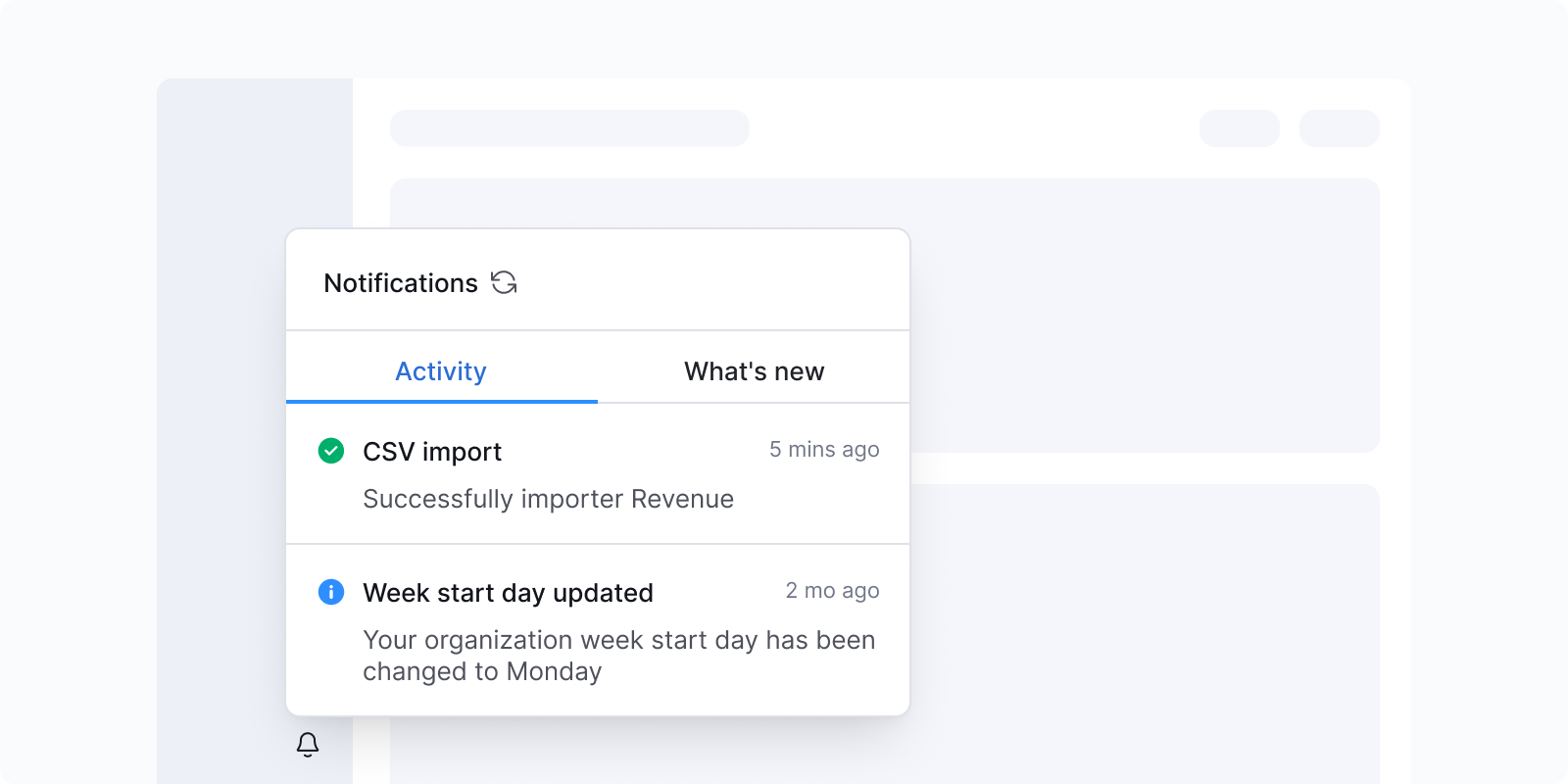
A persistent log of system-generated events that users can revisit. Dismissed interface notifications are not recoverable; notification panel entries are.
What to include:
- Events relevant to the user's work (new report ready, shared with you, comment mention)
- Anything that happened while the user was away
What not to include:
- Transient task feedback (save confirmations, copy actions)
- System noise unrelated to the user's work
Popover
A rich floating element displayed on click or hover. Supports complex content including text, buttons, and icons.
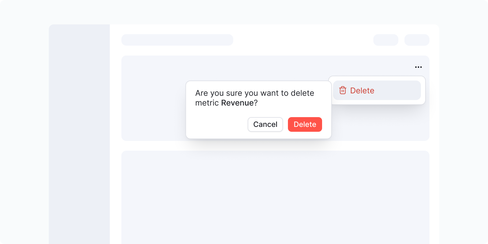
When to use
- Inline confirmation (most common feedback use): when a user clicks delete on a table row or inline item, a Popover appears anchored to that item asking "Are you sure?" with Delete / Cancel actions. This avoids the overhead of a full Modal for simple, low-stakes destructive actions.
- Contextual metadata or detail on hover/click
- Action buttons related to a specific element
Consider alternatives
- For simple text hints → Tooltip
- For high-stakes destructive actions with complex consequences → Modal
- For onboarding flows → Popover (Onboarding)
Progress bar and spinner
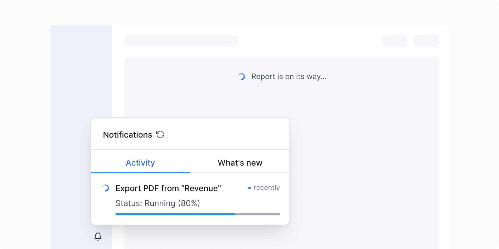
| Component | When to use | Duration |
|---|---|---|
| No feedback | Operation completes instantly | Under 1 second |
| Spinner | Unknown duration; user waits | 1–10 seconds |
| Progress bar | Known duration; user can do other things | 10+ seconds |
Based on Nielsen Norman Group response time thresholds.
Status indicator
A compact colored dot that communicates the state of an item. Used inline in lists, trees, or tables, not as a standalone notification.
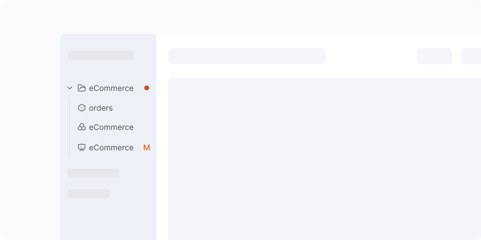
Variants:
- Highlight / New: Blue
- Danger / Deleted: Red
- Warning / Modified: Orange
- Success / Verified: Green
When to use
- Indicating that an item has unsaved changes, is new, deleted, or verified
- Showing item-level status at a glance in dense lists or tree views
Consider alternatives
- For page-level or action-level feedback → Alert or Banner
- When the status needs explanation → pair with a label or use a Badge
Accessibility
Use more than color alone
Color alone doesn't reliably distinguish alert types. Pair with icons and clear copy so the message is understood without color.
Don't auto-dismiss critical or emergency messages
Users with low vision or motor impairments read 1.5–2× slower and need more time to act. A timed dismissal can make them miss critical information. See the Web Content Accessibility Guidelines (WCAG) 2.1, success criterion 2.2.1 Timing Adjustable.
Use ARIA live regions
Screen readers need to announce notification content as it changes. Use the Accessible Rich Internet Applications (ARIA) roles: role="alert" for errors and warnings, and role="status" for info and success.
Provide user control
Let users postpone or suppress non-critical notifications, except emergencies. See WCAG 2.1, success criterion 2.2.4 Interruptions.
Content guidelines
General rules
- Task-generated messages: no need for extensive background, since the user has context from their own action
- System-generated messages: ensure sufficient context since it's unrelated to the user's current task
- Sentence case; no exclamation marks or emoji
- No "please", "sorry", "oops", "oh no"
- Active voice; passive acceptable to soften system errors
- No periods in short notifications or alerts
For full guidelines, visit In-app messages, Grammar and mechanics, and Tone of voice.
Fatigue checklist
Before adding a notification, run through this checklist to avoid overwhelming users:
- Is this notification necessary for the user to know?
- Is it relevant to what they're doing right now?
- Is it in the right place (near the action)?
- Is the right component being used for the urgency level?
- Would a success indicator be self-evident without this message?
- Is the message concise (no more than 1–2 sentences)?
- Does it tell the user what to do next?
- Is it accessible (icon + color, readable duration)?