
Floating UI mechanism
Guides and tips about the mechanisms of floating components.
Concepts
The following are examples of floating UI components:
Consider a dropdown component: when you click the Share button, a dropdown menu appears:
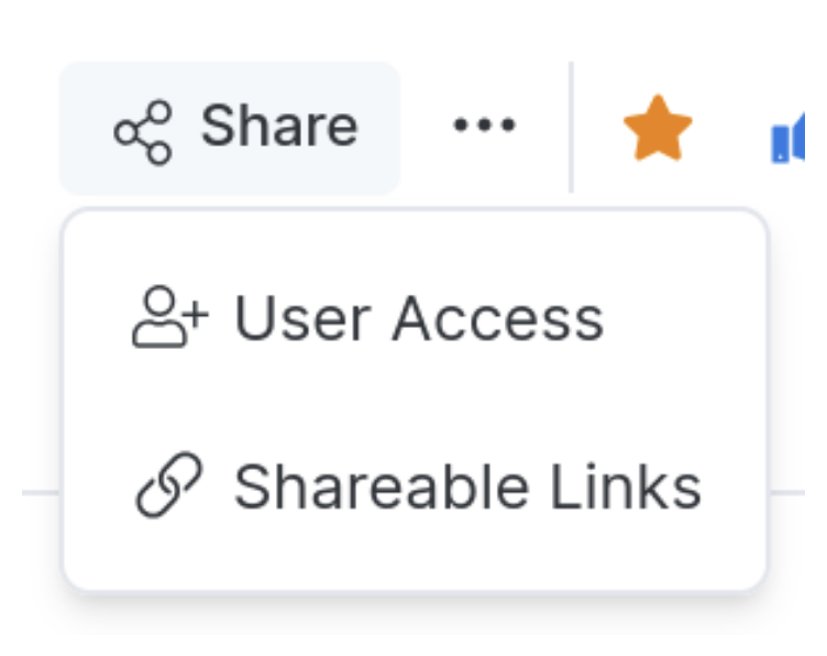
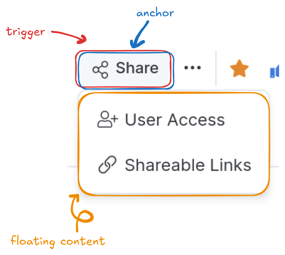
A floating component consists of three parts:
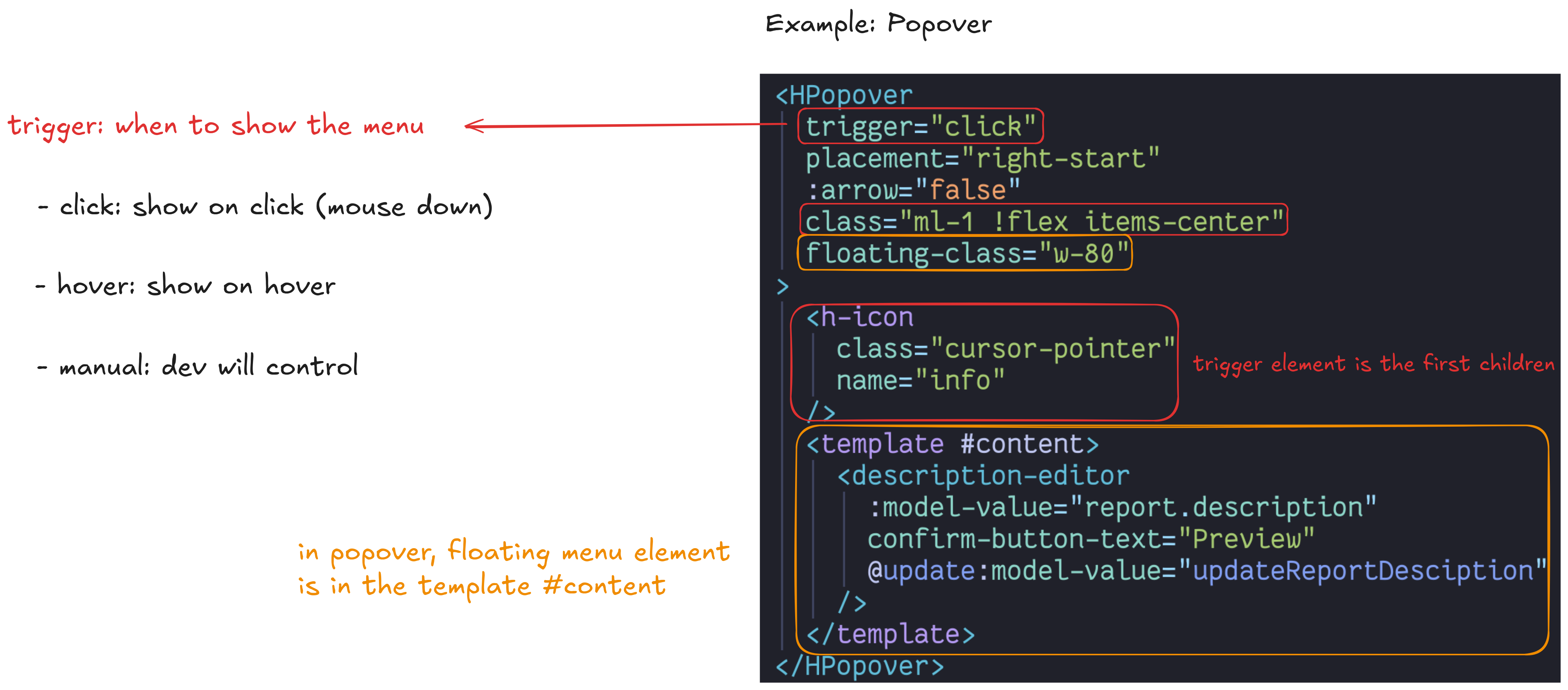
- Trigger: When the user interacts with this element (e.g., focus or click), it toggles the open state of the menu.
- Anchor: When the menu is open, it is positioned relative to this element.
- Floating content: The menu itself.
By default, the trigger also serves as the anchor. Clicking the Share button displays the menu directly beneath it:
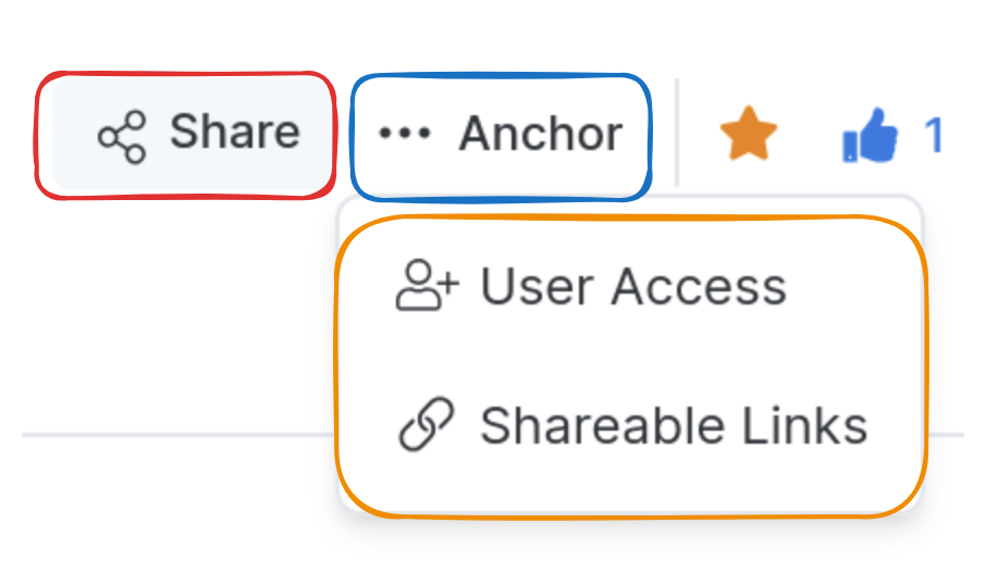
You can change the anchor to display the floating content in a different position (see Changing the anchor):
Basic usage
Props mapping
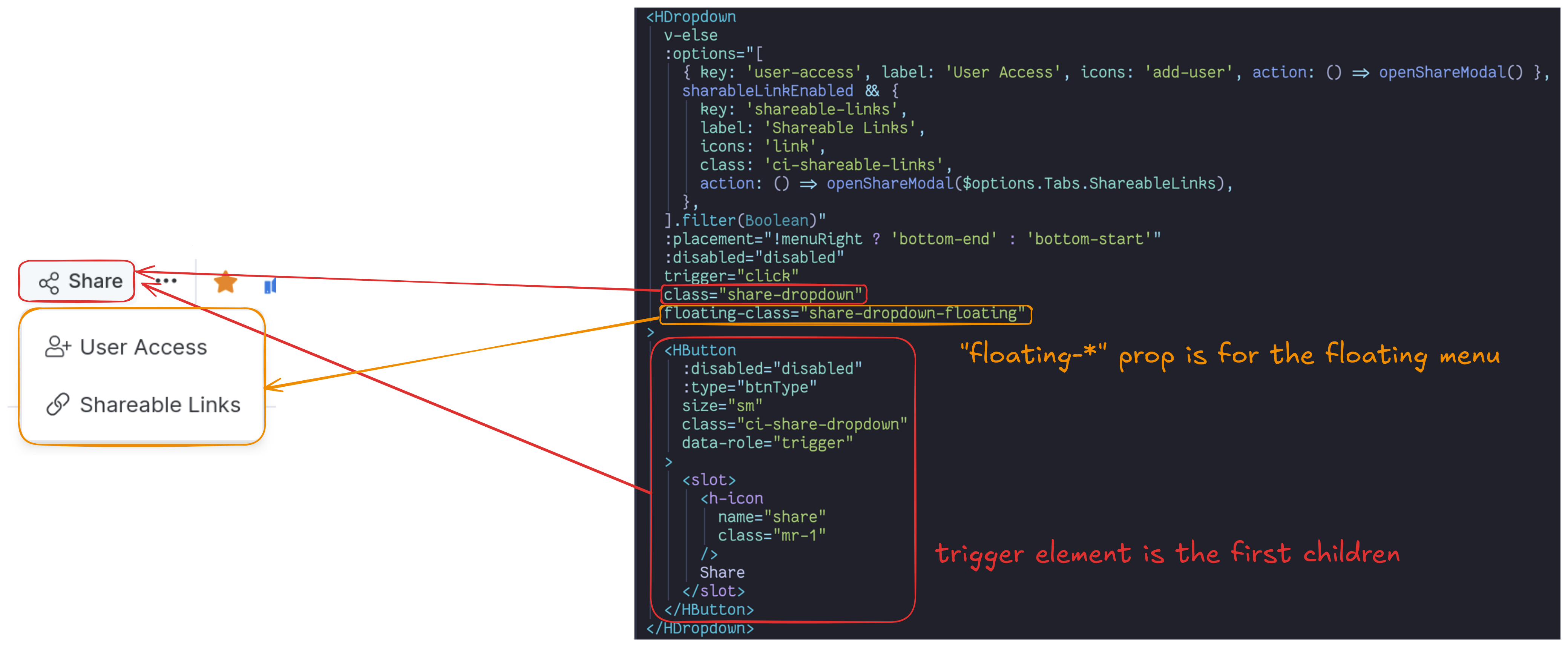
- The trigger element is the first child of the floating component.
floating-*props apply to the floating content element.
Conditional rendering of the trigger element
Don't set v-if directly on the trigger element. It forces the component to re-render, so the floating UI can lose its anchor element reference and the menu appears in the wrong position.
<HDropdown>
  <HButton
    v-if="showButton"
    label="Share"
  />
</HDropdown>
Instead, either move the v-if to the floating component itself (recommended), or wrap the trigger element in a <div>:
<!-- Recommended -->
<HDropdown
  v-if="showButton"
>
  <HButton
    label="Share"
  />
</HDropdown>

<!-- Alternative -->
<HDropdown>
  <div v-if="showButton">
    <HButton
      label="Share"
    />
  </div>
</HDropdown>
Trigger
Changing the anchor

match-anchor-size prop behavior
This prop controls how the floating menu's width is determined.
false: The floating menu size grows freely. 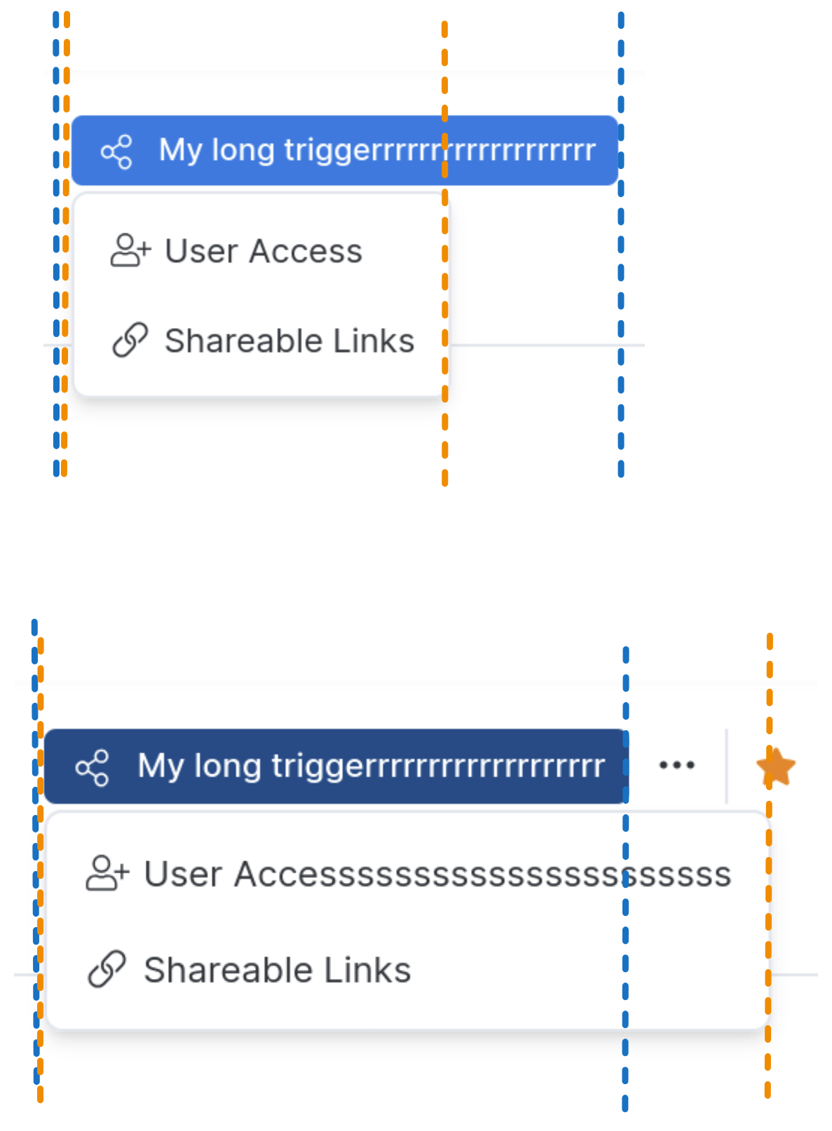 | true: The floating menu size matches the anchor size. 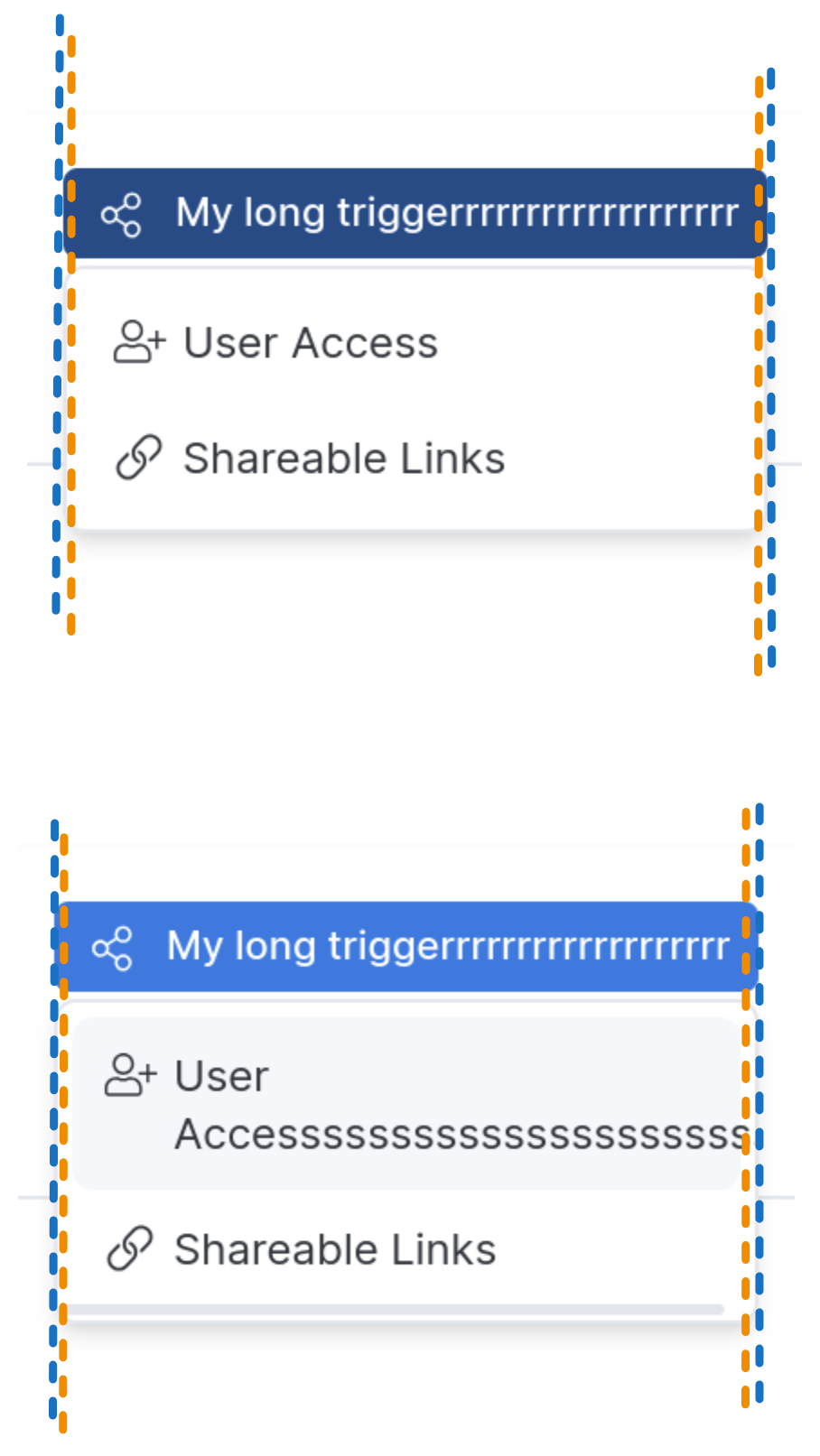 |
min: The minimum floating menu size matches the anchor size. 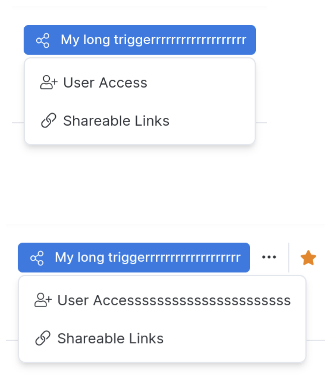 | max: The maximum floating menu size matches the anchor size. 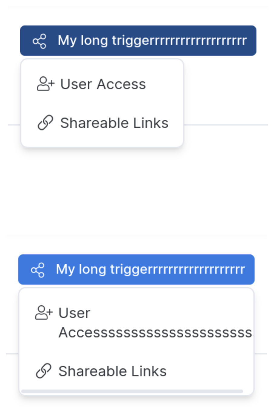 |
Nested layers and click-outside behavior
Scenario
- Clicking Trigger 0 opens Layer 1.
- Clicking Trigger 1 opens Layer 2.
- Clicking Trigger 2 opens Layer 3.
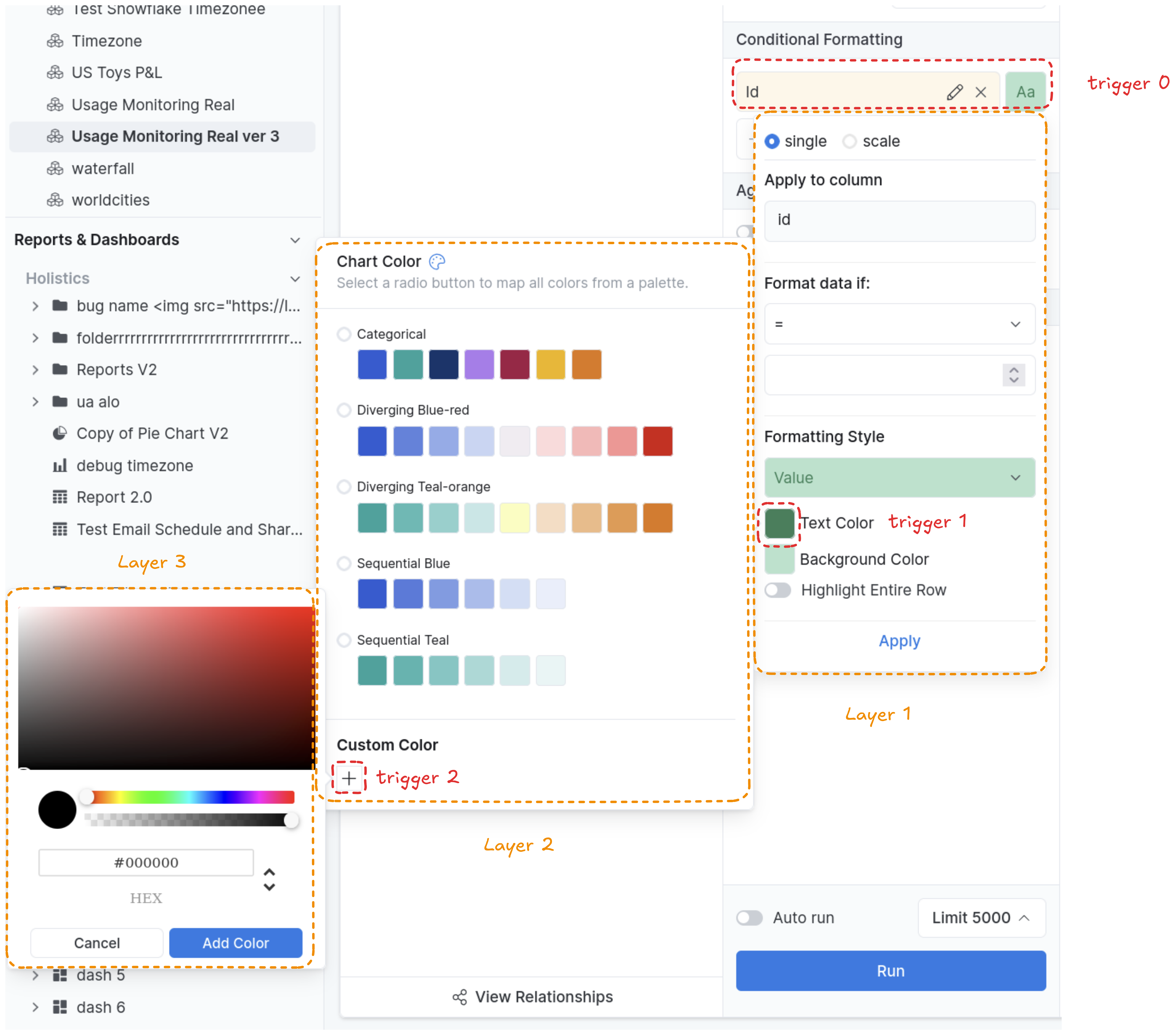
Default behavior
Clicking outside all layers closes all layers.
Clicking inside a child layer (but outside its parent) does not close the parent layer.
For example: Clicking on Layer 3 doesn't close Layer 2.
Closing layers one by one
If you want to close layers one at a time when clicking outside, set the prop disableOutSidePointerEvent = true on each layer you want to behave this way.
Example: If you set this prop to true for Layer 2 and Layer 3:
- Click outside → closes Layer 3.
- Click outside again → closes Layer 2.
- Click outside again → closes Layer 1.