Guideline
Rules, conventions, and best practices for developing the Holistics Design System.
General requirements
When you develop a component, meet the following requirements, ordered by priority:
- P0Meet all requirements from designer(s)
- P1Have good developer experience (DX)
- P1Easy to maintain
- P1Be tested properly, including code coverage, UI testing, and behavior testing
- P1.5Easy to extend
- P1.5Have good performance
- P1.5Be as close as possible to the design
- P2Have comprehensive documentation
- P2Follow industry standards
- P4Easy to migrate
TIP
Under time pressure, you may need to deprioritize testing and documentation to deliver faster. Note clearly when you do.
Conventions
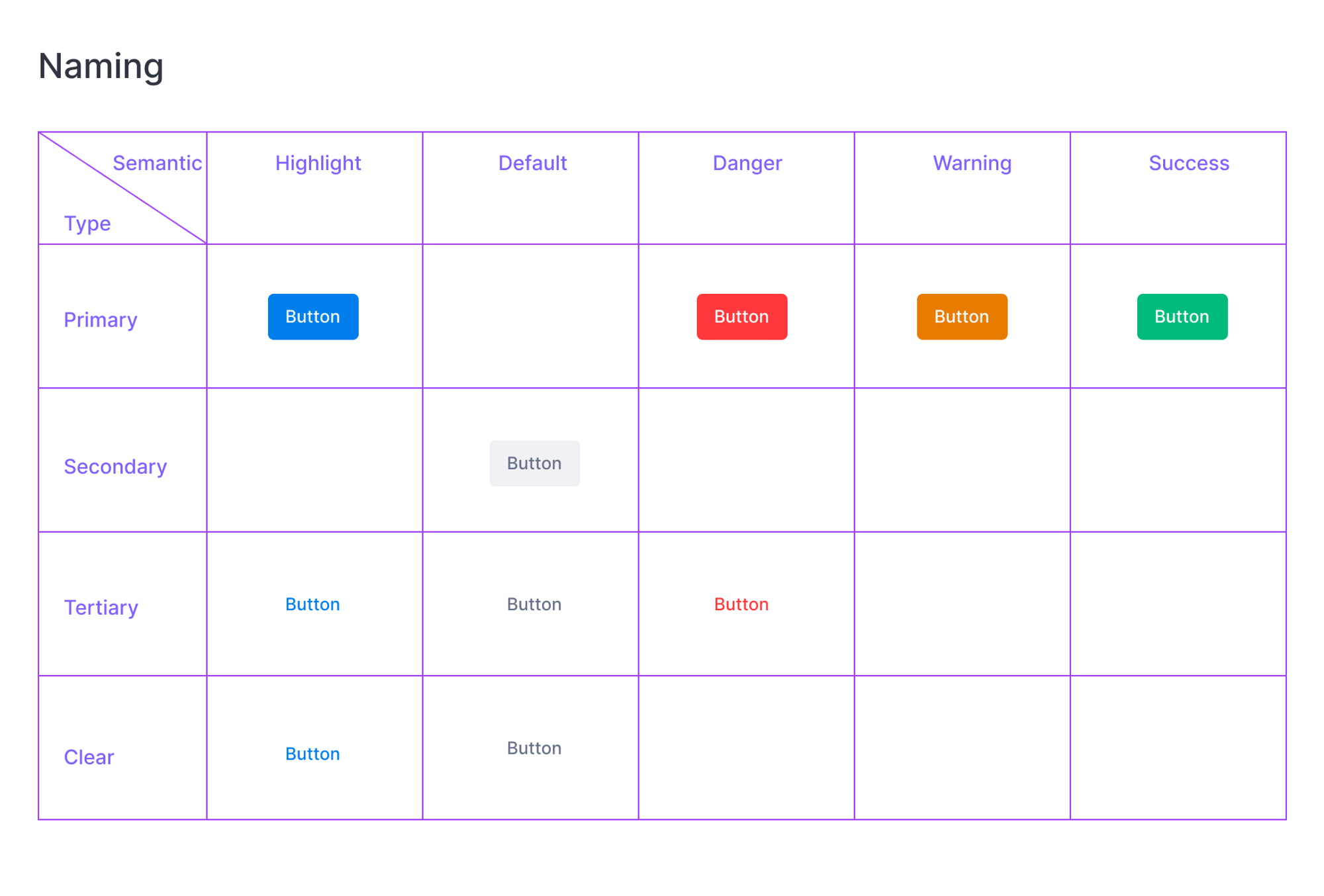
Button naming
Name a
<Button>type as Type, then Semantic.
Type:
- Primary: solid fill button, prominent enough to carry the call to action and draw attention
- Secondary: solid fill button, subtle enough to offer an alternative action
- Tertiary: button with a clear background
- Clear: text button with no background and no padding
Semantic:
- Highlight: in the primary color, for the most prominent action
- Default: in gray
- Danger, Warning, and Success: each in its matching color