
Radio
Lets users pick exactly one option from a group of mutually exclusive options.
Don't use a radio button on its own. Render it inside a group of related radio buttons, using a Radio Group. Users can't uncheck a radio button, so only use radio buttons when a selection is required.
Anatomy
.png)
- Radio button: shows the checked or unchecked state
- Label: describes the option that users can select
- Information icon (optional): provides additional context on hover
States
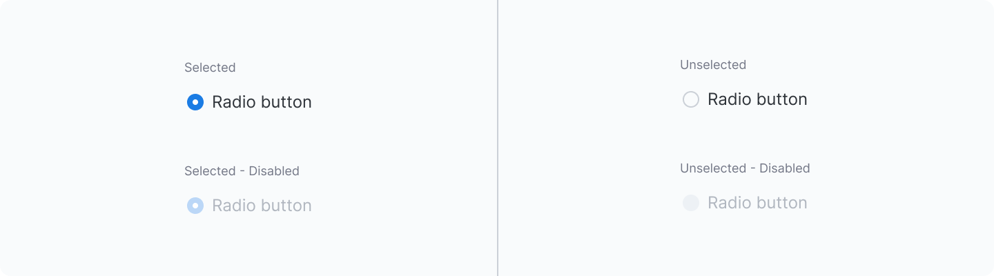
Mixed disabled state
This example will disable the individual option, but you can disable the entire group by setting the disabled prop on the Radio Group.
With description
You can add description text below the radio label using the description prop or the description slot.
Usage guidelines
When to use
Use radio buttons when users can only select one option from a list.
Consider alternatives
- To allow users to select none, one, or multiple options, use Checkbox.
- To allow users to turn a setting on or off with immediate effect, use Switch.
- To avoid overwhelming users when there are more than 7 options, use Select.
Best practices
Use radio buttons in groups to select exactly one option.
Once selected, a radio button can't be cleared. Users must choose another option in the same group. Use radio buttons when a selection is required and mutually exclusive.
Do
Use checkboxes when no selection is allowed
.png)
Don't
Use radio buttons when no selection is a valid state
.png)
None option
Include a None option if users can skip a selection. It works as an unselect option when users pick an option by accident, or when they want no selection at all.
Do
Include None if users may need an unselected state. Users can't clear an option without selecting a different one
.png)
Don't
Leave out None if an unselected state is possible. Users may have to select an option they don't want
.png)
Alignment
When possible, arrange the checkbox and radio button groups vertically for easier reading. Use a horizontal layout if there is limited vertical space, with a maximum of 3 items.
Do
Lay out radio buttons vertically
.png)
Use with caution
Lay out radio buttons horizontally when labels are short, with enough spacing to keep each option distinct.
.png)
Pre-select
Pre-selection helps users move faster, but increases the risk of unintentional selection.
Pre-select options by default, while ensuring the selected option is safe, non-destructive, and commonly used.
Do
Pre-select options only when the default is safe, common, and unlikely to cause unintended outcomes
Don't
Pre-select options when the impact isn't clearly safe or expected
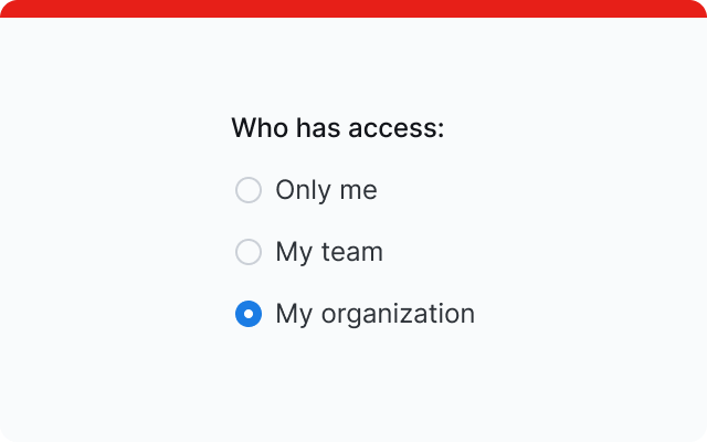
Listing
In some cases, ordering options intentionally can improve scannability and decision-making.
Common patterns include ordering by:
- Most likely to least likely to be selected
- Simplest to most complex operation
- Least to most risk
.png)
Content
Group labels
Group labels provide context for the set of options below and help users distinguish between radio button groups.
- Use sentence case
- Keep it concise (2–5 words maximum)
Helper text
Use helper text to provide additional context or instructions.
Radio label
Describe what selecting each radio option will do.
- Use sentence case
- Use parallel structure across options
- Do not use punctuation at the end of labels
- Use positive wording
- Be mindful of:
- Numeric ranges that overlap. For example, 0–20 and 20–40 both include 20, so a 20-year-old can't tell which to pick.
- Numeric ranges that skip a number. For example, Below 20 and Above 20 leave a 20-year-old with no option.
- Add an Other option when you can't list every possible choice.
Error messages
Display when validation fails. Be specific and actionable: explain what's wrong and how to fix it.