Form
A form component which allows users to input data.
<script setup lang="ts">
import { z } from 'zod'
import {
  useHForm,
  HCheckbox,
  HButton,
} from '@holistics/design-system'
import EmailComposableField from './EmailComposableField.vue'
import PasswordComponentField from './PasswordComponentField.vue'

const schema = z.object({
  email: z.email(),
  password: z.string().min(8),
  rememberMe: z.boolean(),
})

const {
  handleSubmit, errors, values, HForm, HField,
} = useHForm({
  validationSchema: schema,
  initialValues: {
    email: '',
    password: '',
    rememberMe: false,
  },
})

const onSubmit = handleSubmit(data => {
  console.log(data)
})
</script>

<template>
  <div
    data-testid="container"
    class="flex max-w-md flex-col text-wrap"
  >
    <HForm>
      <EmailComposableField />
      <PasswordComponentField
        label="Password"
        name="password"
      />
      <HField
        v-slot="{ fieldProps }"
        name="rememberMe"
      >
        <HCheckbox
          v-bind="fieldProps"
          label="Remember Me"
        />
      </HField>
      <HButton
        type="primary-highlight"
        @click="onSubmit"
      >
        Submit
      </HButton>
    </HForm>
    <div class="mt-4">
      <pre>values: {{ values }}</pre>
      <pre>errors: {{ errors }}</pre>
    </div>
  </div>
</template>Behaviors
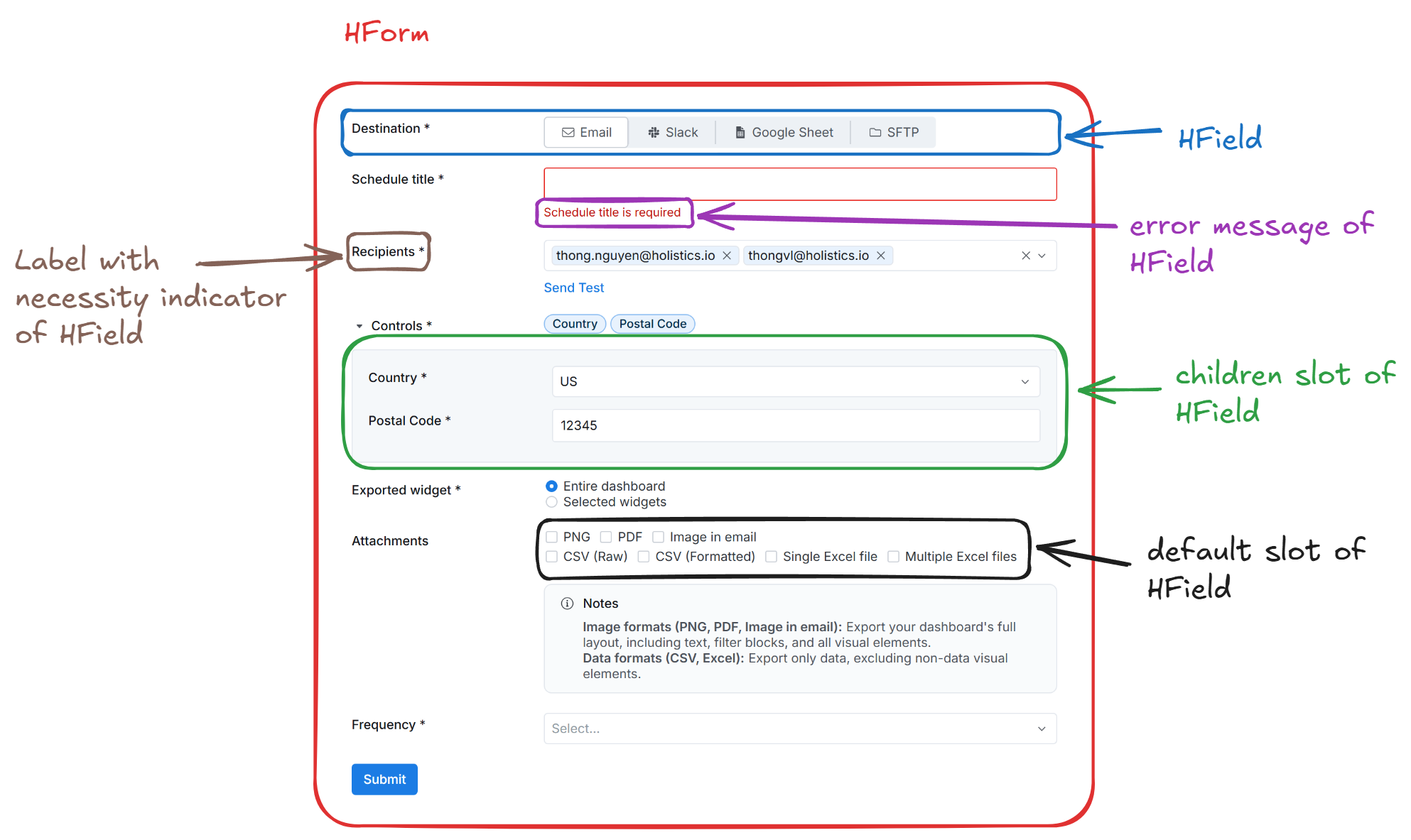
Necessity indicator
By default, if you define a field is required in the validation schema, the HField will automatically add a necessity indicator (a black asterisk) next to the label. You can customize this behavior by passing the necessity-indicator prop to the HField component.
<!-- To force hide the necessity indicator -->
<HField
  necessity-indicator="never"
/>
Validation states
The form exposes several reactive states via the meta object returned from useHForm:
- valid:
boolean- True if all fields are valid. - dirty:
boolean- True if at least one field value has changed. - touched:
boolean- True if at least one field has been blurred. - pending:
boolean- True if validation is in progress (async validation).
Additionally, isSubmitting and isValidating refs are available directly from useHForm for tracking submission and validation status.
Examples
Validation mode
onBlur: Validates input after the field control is lost focus
onChange: Validates input in real-time after user interaction
<script setup lang="ts">
import { z } from 'zod'
import { useHField, FormFieldValidationMode, HTextInput } from '@holistics/design-system'

const { HField } = useHField({
  path: 'email',
  rules: z.email(),
  opts: { validationMode: FormFieldValidationMode.OnBlur },
})

const { HField: HField2 } = useHField({
  path: 'email2',
  rules: z.email(),
  opts: { validationMode: FormFieldValidationMode.OnChange },
})
</script>

<template>
  <div
    class="flex flex-col gap-4"
    data-testid="container"
  >
    <HField label="Email (validate on blur)">
      <template #default="{ fieldProps }">
        <HTextInput
          v-bind="fieldProps"
          type="email"
          autocomplete="email"
        />
      </template>
    </HField>

    <HField2 label="Email (validate on change)">
      <template #default="{ fieldProps }">
        <HTextInput
          v-bind="fieldProps"
          type="email"
          autocomplete="email"
        />
      </template>
    </HField2>
  </div>
</template>Label position
- top: The label is placed above the field
<script setup lang="ts">
import { z } from 'zod'
import { useHForm, HTextInput } from '@holistics/design-system'

const schema = z.object({
  name: z.string(),
  email: z.email(),
})

const { HForm, HField } = useHForm({
  validationSchema: schema,
})
</script>

<template>
  <HForm class="flex w-full max-w-md flex-col gap-4">
    <HField
      name="name"
      label="Name"
      label-position="top"
    >
      <template #default="{ fieldProps }">
        <HTextInput
          v-bind="fieldProps"
          placeholder="Enter your name"
        />
      </template>
    </HField>

    <HField
      name="email"
      label="Email"
      label-position="top"
    >
      <template #default="{ fieldProps }">
        <HTextInput
          v-bind="fieldProps"
          placeholder="Enter your email"
        />
      </template>
    </HField>
  </HForm>
</template>- left: The label is placed to the left of the field
<script setup lang="ts">
import { z } from 'zod'
import { useHForm, HTextInput } from '@holistics/design-system'

const schema = z.object({
  name: z.string(),
  email: z.email(),
})

const { HForm, HField } = useHForm({
  validationSchema: schema,
})
</script>

<template>
  <HForm class="flex w-full max-w-md flex-col gap-4">
    <HField
      name="name"
      label="Name"
      label-position="left"
    >
      <template #default="{ fieldProps }">
        <HTextInput
          v-bind="fieldProps"
          placeholder="Enter your name"
        />
      </template>
    </HField>

    <HField
      name="email"
      label="Email"
      label-position="left"
    >
      <template #default="{ fieldProps }">
        <HTextInput
          v-bind="fieldProps"
          placeholder="Enter your email"
        />
      </template>
    </HField>
  </HForm>
</template>Integrate with field controls
Example with Select, Radio Group and Checkbox
<script setup lang="ts">
import { z } from 'zod'
import type { FormFieldLabelPosition } from '@holistics/design-system'
import {
  useHForm,
  HTextInput,
  HSelect,
  HRadioGroup,
  HRadio,
  HCheckbox,
  HButton,
} from '@holistics/design-system'

const props = defineProps<{
  labelPosition: FormFieldLabelPosition
}>()

const {
  HForm, HField, values, handleSubmit, handleReset,
} = useHForm({
  validationSchema: z.object({
    databaseType: z.enum(['mysql', 'postgresql']),
    name: z.string().min(1),
    connectionMode: z.enum(['direct', 'proxy']),
    host: z.string().min(1),
    port: z.number().min(1),
    username: z.string().min(1),
    password: z.string().min(1),
    database: z.string().min(1),
    requireSSL: z.boolean(),
  }),
  initialValues: {
    connectionMode: 'direct',
  },
})

const onSubmit = handleSubmit(data => {
  console.log(data)
})
</script>

<template>
  <div class="w-2/3 rounded border p-3">
    <HForm
      :label-position="props.labelPosition"
    >
      <HField
        v-slot="{ fieldProps: { id, ...rest } }"
        label="Database type"
        name="databaseType"
      >
        <HSelect
          v-bind="rest"
          :input-id="id"
          filterable
          :options="[
            {
              label: 'MySQL',
              value: 'mysql',
            },
            {
              label: 'PostgreSQL',
              value: 'postgresql',
            },
          ]"
        />
      </HField>
      <HField
        v-slot="{ fieldProps }"
        label="Display name"
        name="name"
        :tooltip="{
          content: 'The name of the data source',
        }"
      >
        <HTextInput
          v-bind="fieldProps"
        />
      </HField>
      <HField
        v-slot="{ fieldProps }"
        label="Connection mode"
        name="connectionMode"
        necessary-indicator="never"
      >
        <HRadioGroup
          v-bind="fieldProps"
          orientation="horizontal"
          class="flex gap-4"
        >
          <HRadio
            value="direct"
          >
            Direct connection
          </HRadio>
          <HRadio
            value="proxy"
          >
            Use reverse tunnel
          </HRadio>
        </HRadioGroup>
      </HField>
      <hr class="my-4">
      <div class="grid grid-cols-2 gap-4">
        <HField
          v-slot="{ fieldProps }"
          label="Host"
          name="host"
          :tooltip="{
            content: 'The host of the data source',
          }"
        >
          <HTextInput
            v-bind="fieldProps"
          />
        </HField>
        <HField
          v-slot="{ fieldProps }"
          label="HTTP(S) Port"
          name="port"
          :tooltip="{
            content: 'The port of the data source',
          }"
        >
          <HTextInput
            v-bind="fieldProps"
            type="number"
          />
        </HField>
      </div>
      <HField
        v-slot="{ fieldProps }"
        label="Database name"
        name="database"
      >
        <HTextInput
          v-bind="fieldProps"
        />
      </HField>
      <div class="grid grid-cols-2 gap-4">
        <HField
          v-slot="{ fieldProps }"
          label="Username"
          name="username"
        >
          <HTextInput
            v-bind="fieldProps"
          />
        </HField>
        <HField
          v-slot="{ fieldProps }"
          label="Password"
          name="password"
        >
          <HTextInput
            v-bind="fieldProps"
          />
        </HField>
      </div>
      <HField
        v-slot="{ fieldProps }"
        name="requireSSL"
      >
        <HCheckbox
          v-bind="fieldProps"
          label="Require SSL"
        />
      </HField>
      <div class="flex gap-2">
        <HButton
          type="primary-highlight"
          @click="onSubmit"
        >
          Test connection
        </HButton>
        <HButton
          type="secondary-default"
          @click="handleReset"
        >
          Reset
        </HButton>
      </div>
    </HForm>
    <pre>Values: {{ values }}</pre>
  </div>
</template>API
Pass-through: <div>
What does this mean?
All props, events, and attrs that are not specified in the tables below will be passed to the element/component described above.
Props
| Name | Type | Description |
|---|---|---|
labelPosition | FormFieldLabelPosition= "top" | |
labelAlign | FormFieldLabelAlign= "left" | |
disabled | boolean= false | |
spacing | "sm" | "md" | "lg"= "md" | Spacing between fields |
Slots
| Name | Scoped | Description |
|---|---|---|
#default | {} |
useHForm composable
Parameters
| Name | Type | Description |
|---|---|---|
validationSchema * | ZodType<object, object> | Zod schema definition that powers both validation and the slot typings of the form. |
initialValues | PartialDeep<Input> | null | undefined | Optional initial values for the schema keys. Useful for editing flows or seeding defaults. |
Return
| Name | Type | Description |
|---|---|---|
HForm | typeof HForm | Holistics form wrapper component that wires labels, layout spacing, and submission context. |
HField | typeof HField | Typed field component that maps slot bindings to the schema fields defined in the composable. |
HFieldSubscribe | typeof HFieldSubscribe | Light-weight subscription component that lets you react to field-level state without rendering controls. |
values | GenericObject | Reactive object that always reflects the current raw form values. |
errors | ComputedRef<Record<string, string | undefined>> | Computed error bag keyed by field path. |
meta | ComputedRef<FormMeta<GenericObject>> | Aggregated metadata such as dirty, touched, and valid flags sourced from vee-validate. |
handleSubmit | (<TReturn>(cb: SubmissionHandler) => (event?: Event) => Promise<TReturn | undefined>) | Utility that validates the form and only invokes the provided callback when the data passes. |
handleReset | () => void | Resets every field back to its initial value and clears touched/error state. |
submitForm | (event?: unknown) => Promise<void> | Promise-based submit helper that mirrors native form submission semantics. |
resetField | (path: string, state?: Partial<FieldState>) => void | Resets an individual field to a known state, optionally overriding parts of its meta. |
validate | (options?: Partial<ValidationOptions>) => Promise<FormValidationResult> | Runs validation for the entire form and resolves with the aggregated result. |
validateField | (path: string, options?: Partial<ValidationOptions>) => Promise<ValidationResult> | Validates a single field path and returns its validation outcome. |
setFieldValue | (path: string, value: unknown, shouldValidate?: boolean) => void | Programmatically updates a field value and optionally re-validates it. |
setValues | (fields: Record<string, unknown>) => void | Bulk-updates multiple field values at once, useful for patching server data. |
setErrors | (errors: Record<string, string | string[] | undefined>) => void | Allows manually setting validation errors, for example when the server returns API issues. |
setTouched | (fields: boolean | Record<string, boolean>) => void | Marks one or many fields as touched or untouched. |
defineComponentBinds | <TPath extends string>(path: TPath, options?: Record<string, unknown>) => Record<string, unknown> | Helper that returns binding objects so you can spread form props directly onto inputs. |
controlledValues | Ref<GenericObject> | Reactive reference that always mirrors the values being tracked internally by vee-validate. |
submitCount | Ref<number> | Counts how many times the form attempted to submit. |
errorBag | Ref<Partial<Record<string, string[]>>> | Holds the raw multi-message errors emitted by vee-validate for each field path. |
isSubmitting | Ref<boolean> | Flags whether a submit handler is still pending. |
isValidating | Ref<boolean> | Signals that synchronous or asynchronous validation is currently running. |
createPathState | (path: MaybeRef<string>, config?: Partial<PathStateConfig>) => PathState | Creates a derived object that tracks a single field path, handy for watchers or custom UIs. |
name | string | The unique name vee-validate assigns to this form instance. |